Flampact
Fluid Duotone Design
 The Flampact design demonstrates how duotone design can work as a fluid, high-contrast composition.
Drawing inspiration from both mother nature and the deep sea, this design presents a flat cut through the earth itself. It illustrates the static upstream movement of bubbles of air and the flow created by underwater caves. Finally, the design is composed in direct opposition to fire, demonstrating the substantial impact that the combination of these two opposing elements can have.
All these characteristics provide ways to integrate the user more in the center of the design. By using bubbles of air in combination with underwater caves, flow is created, driving bubbles up, and steering them in one specific direction.
Concept
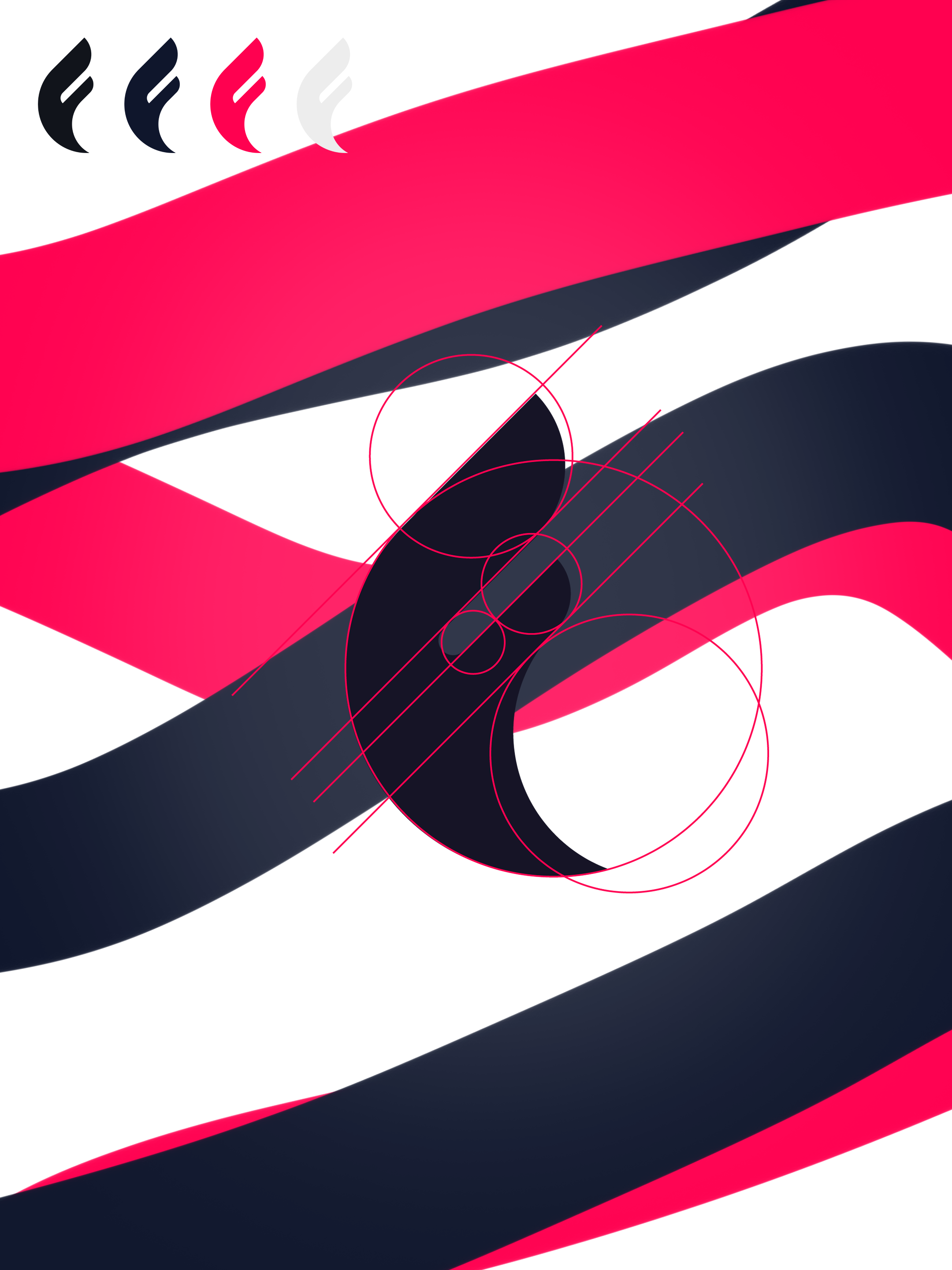 The design was created with the inspiration of the golden ratio, which is found in many places in nature and is known to be aesthetically pleasing. Its perfectly balanced ratios played a major role in the creation of the whole design system, but first and foremost in designing a fluid yet impactful iconic mark.
Some parts of the iconic mark were adapted later to fully fit in with the fluid motion, the core of the design.
Brand Identity Elements
 Demonstration of the full lookup Flampact logo in contrast on the respective opposing colors.
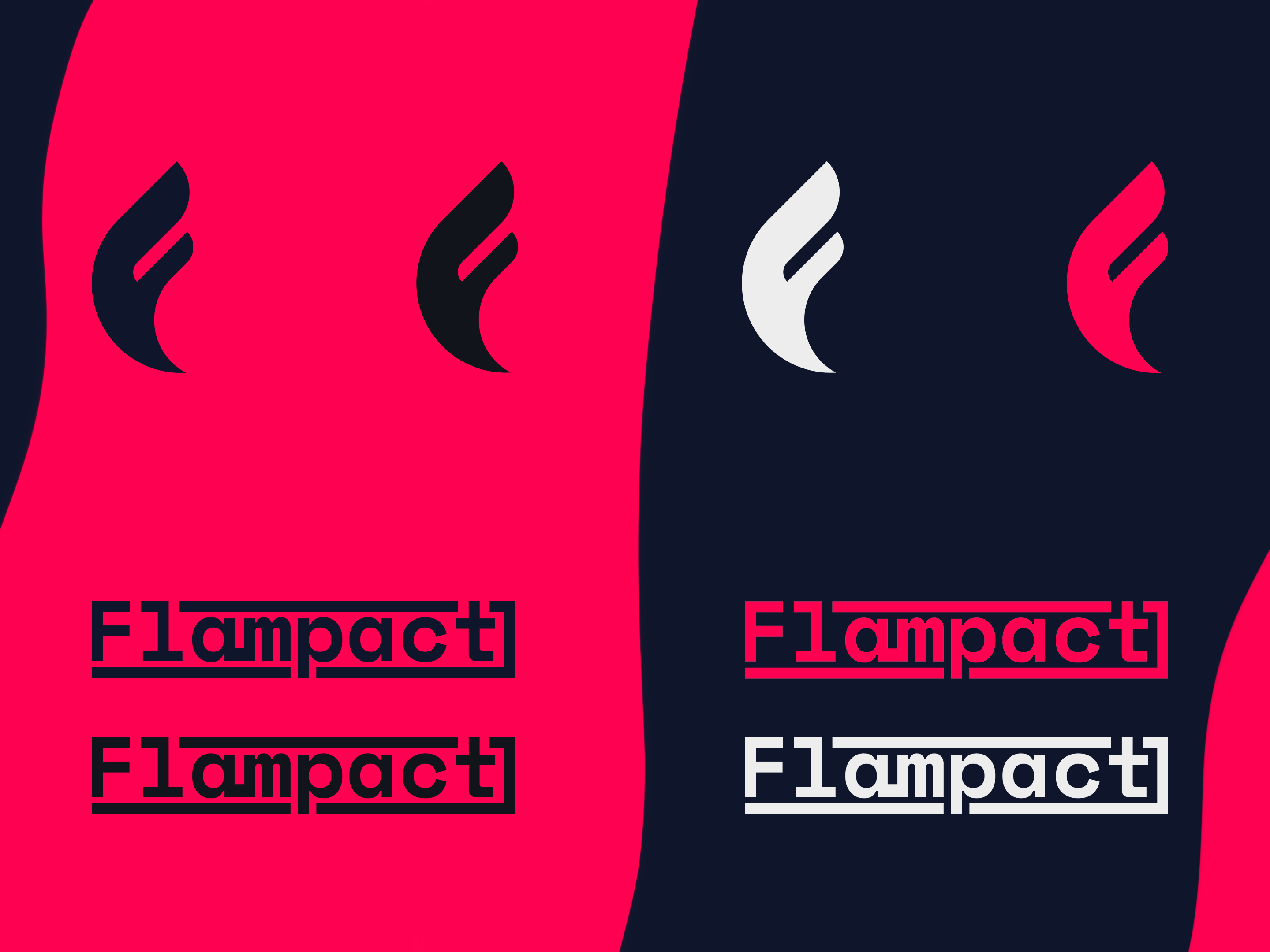 Demonstration of the iconic and wordmark Flampact logo in contrast on the respective opposing colors, combining nearly all available color combinations.
To achieve a versatile design that’s ready for everyday work, both lighter and darker colors were provided to keep up with the increasing contrasts.
Brand in Action
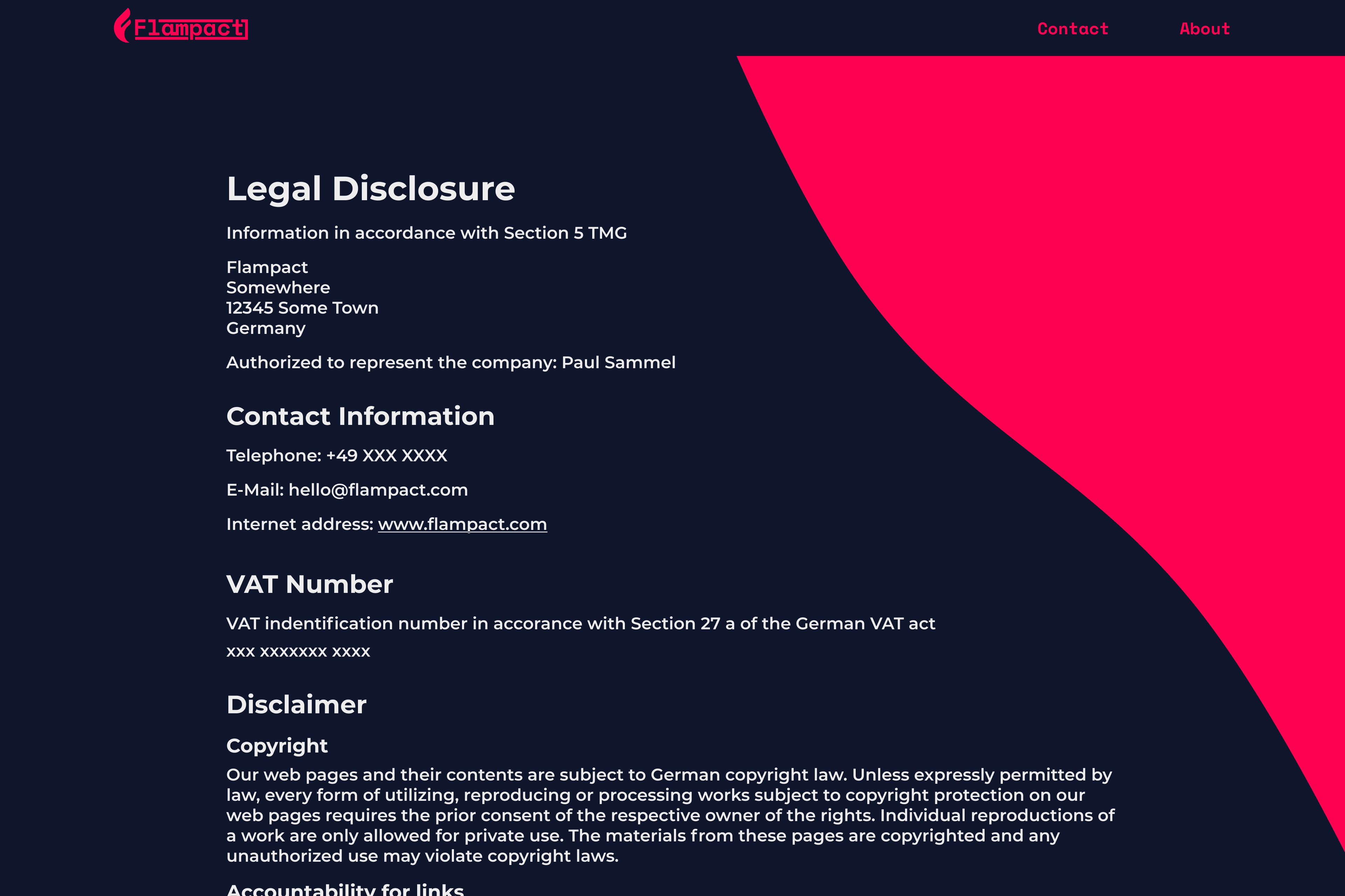 In order to create a pleasant reading experience, I decided to go with Montserrat in different weights. Space Mono is reserved for highlights, such as the navigation bar, CTAs and footer links. It’s a fixed-width type family font, so it doesn’t provide as much reading flow compared to Montserrat.
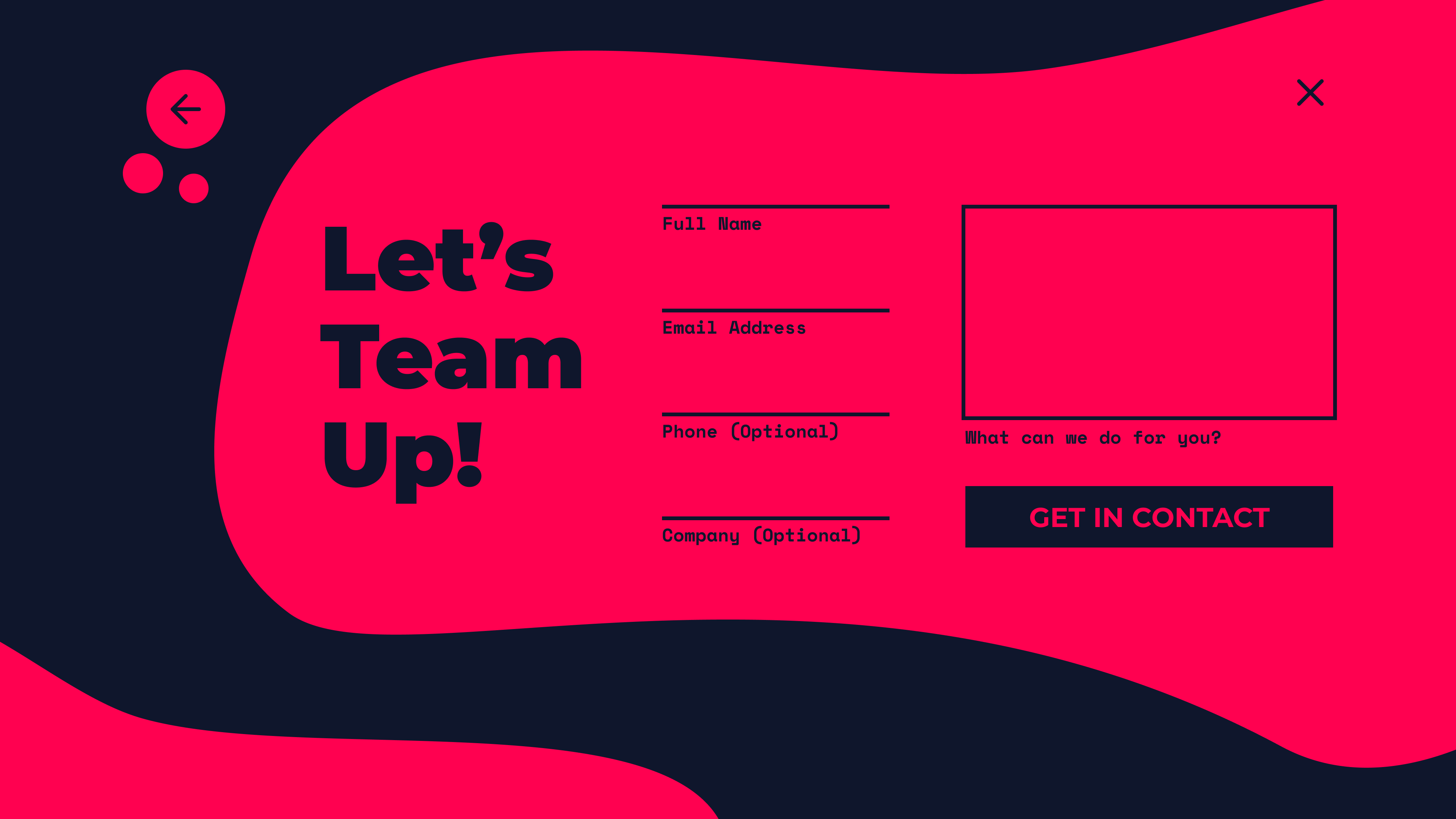 To further paint the image of what’s possible with the fluid dynamics of this design, this example web page shows how details like bubbles of air are used to create user flow.
To fully embrace what’s possible, I recommend to combine this example flow with a long landing page, creating key elements to focus on, transitioning sections and more.