Selca
Applying illusion of depth and volume
 The Selca design system is one-of-a-kind to convey depth and airiness in a perfectly balanced and dynamic atmosphere.
Vibrant colors create an inviting, flexible room, combining lines, gradients, and blur as key elements. Rounded edges and corners provide stability and ensure that every guest feels safe and welcome.
Concept
![]() The logo is constituted by a single complete circle and a second bisected one. The minimal contact between the two shapes symbolizes the perfect balance between volume and open space, which allows for flexibility and independence.
The logo is constituted by a single complete circle and a second bisected one. The minimal contact between the two shapes symbolizes the perfect balance between volume and open space, which allows for flexibility and independence.
My initial concept was inspired by the rule of thirds, a compositional technique commonly observed in nature photography. This concept formed the basis for the creation of a logo that employs a volumetric design to create a striking contrast against the illusionistic density of the design system around it, effectively conveying the concept of balance.
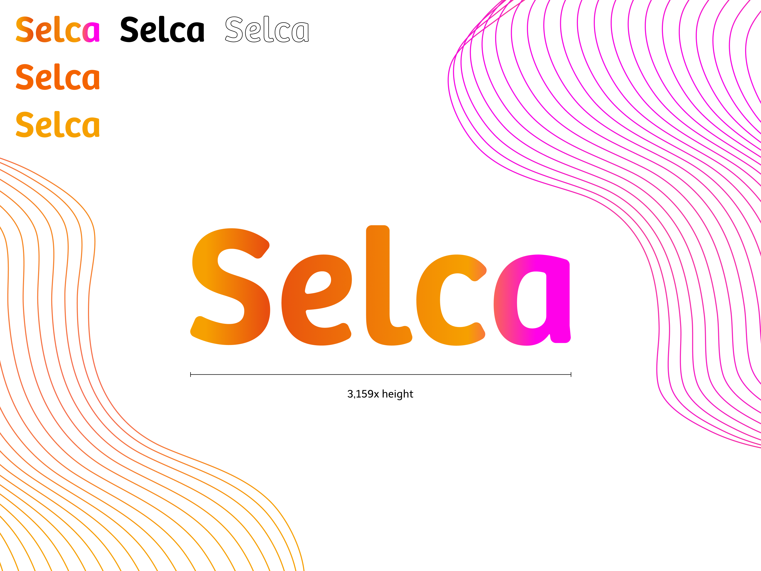 The Selca wordmark is based on the Bree font. Its edges and corners were adapted to the overall style of the design. To embody the language and properly convey the feeling of the design, the Selca gradient will be showcased primarily. Dark and light backgrounds are not a problem, but if greater contrast is needed, light, dark and primary colors are available as silhouettes.
Brand Identity Elements
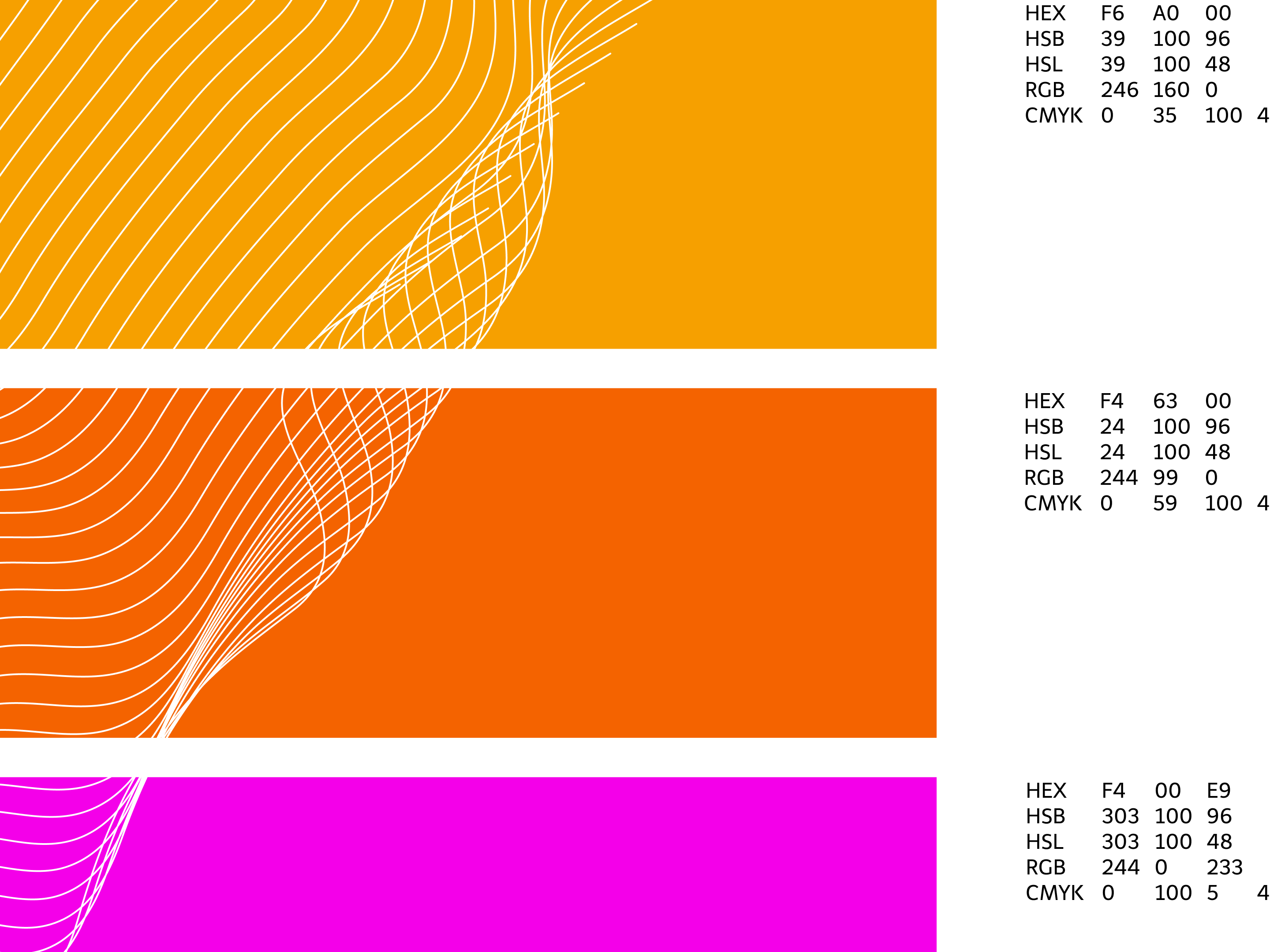 I chose these colors specifically to convey warmth and stability. The design needed to be welcoming and make guests feel at home. Given the Selca design system’s emphasis on flow, balance, and depth, it was crucial for the colors to align seamlessly in a gradient, a core element of the design.
When inverting the black and white colors used it’s possible to use the design with a dark finish, effectively creating a dark mode to reduce strain on the user’s eyes.
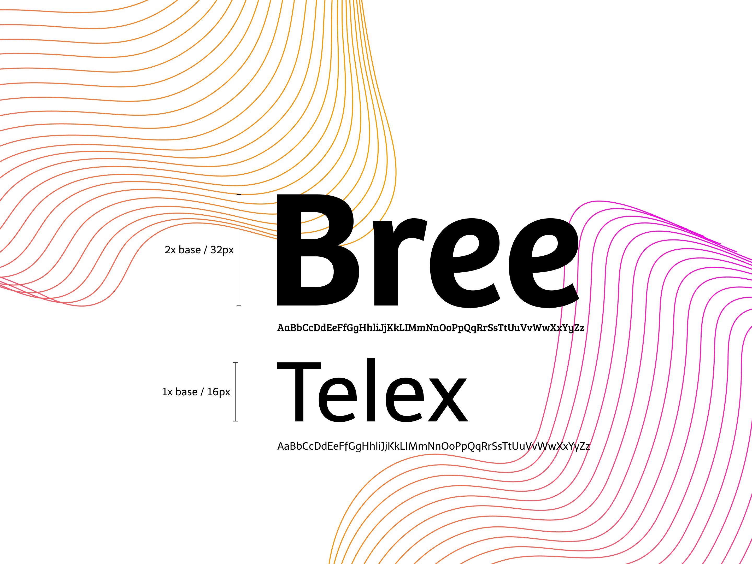 The Bree font makes an ideal headline font, giving the whole design more dynamic and enthusiasm. Together, Telex provides the stability that balances with Bree’s enthusiasm, creating a great dynamic duo. The two fonts are matched with a classical 1:2 ratio in size which is fine for this basic use case. For complex layouts using differentiating headlines, use a varied approach, such as determining variations using the golden ratio.
Brand in Action
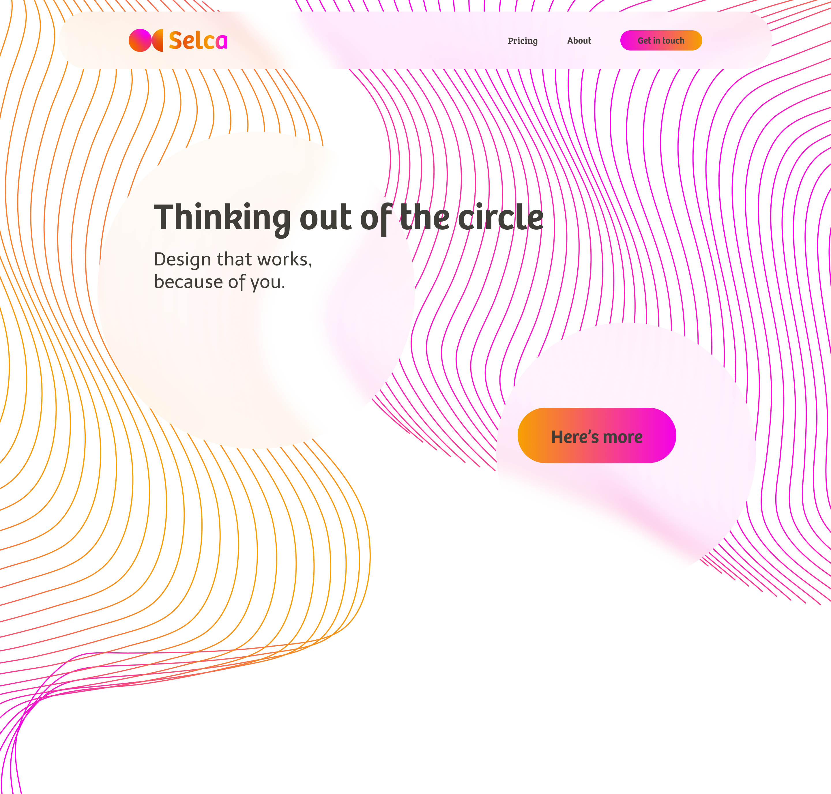 In this mockup example for a website, blurry circles are used as a metaphor for floating islands where the user can rest his eyes. The navigation bar itself remains pinned to the top to always provide a way to navigate while never making the user feel lost. Gradient buttons act as CTAs, positioned on blurred islands and surrounded by lines that guide the user through the site. For this design to work, a lot of negative space needs to be used, otherwise it will quickly become cluttered and destroy the designs core objective.
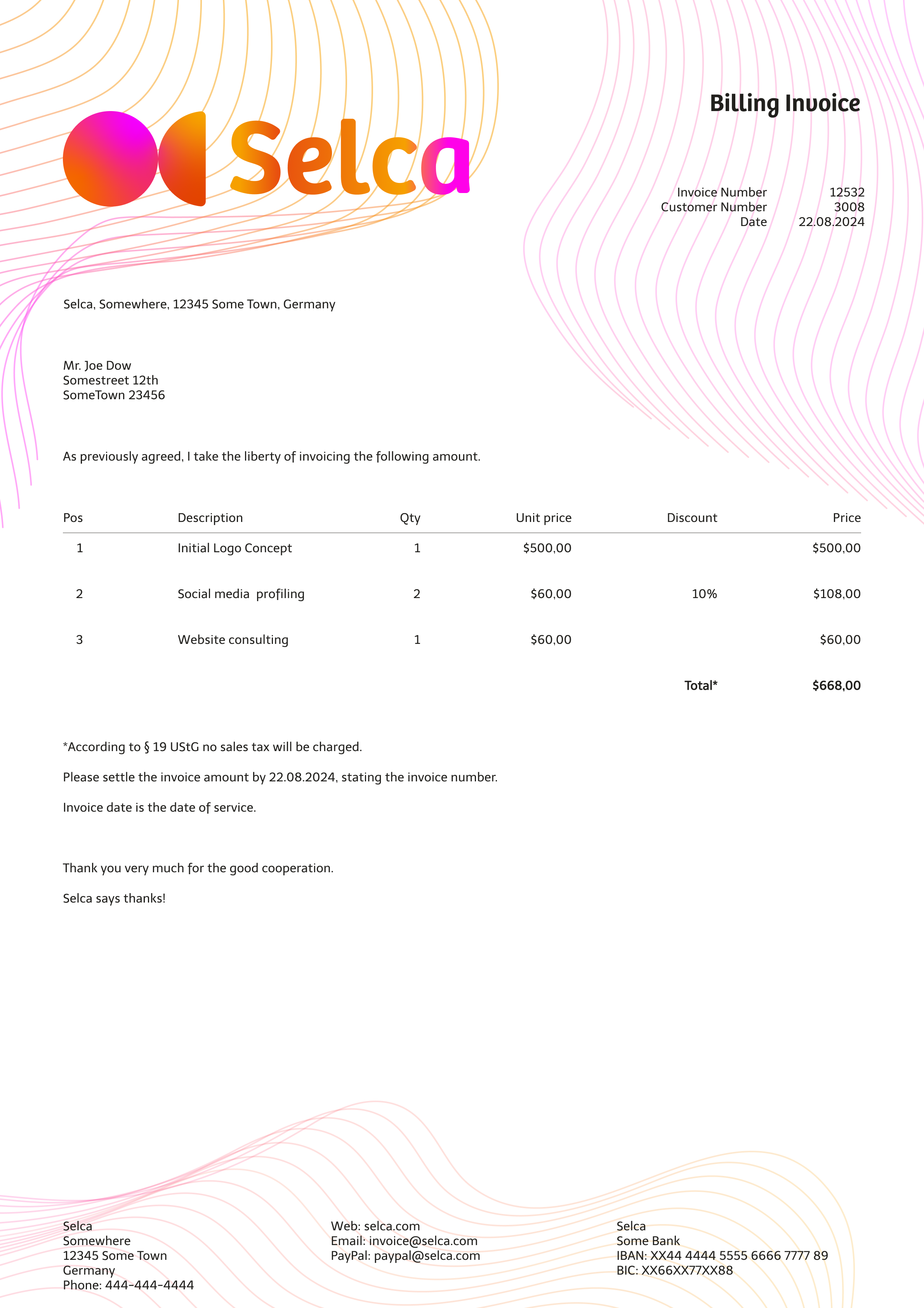 This letterhead fits in with the first mockup example and makes a bold statement with the full lookup logo, creating instant recognition value. The slightly lighter-than-usual background lines in Selca colors ensure better readability in case the letter has to be printed out.